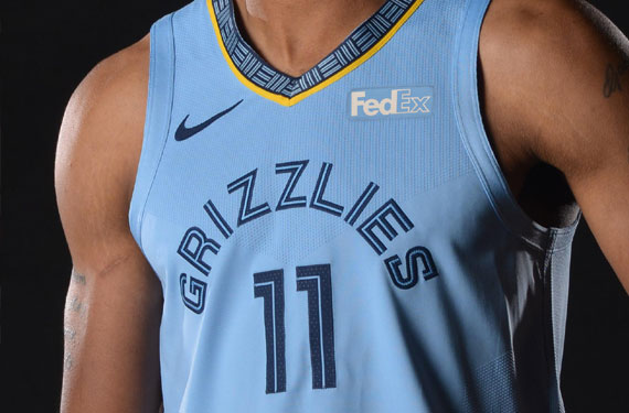
Here at INTBQ, there are a few things we look for in a modern NBA team- a well-rounded coaching staff, good ball movement, and above all else, drip.
So we took the time to break down which teams are slaying and which are dismaying.
Below is the tier list ranking of every current NBA jersey, including alternates, with additional commentary on a few select standouts.
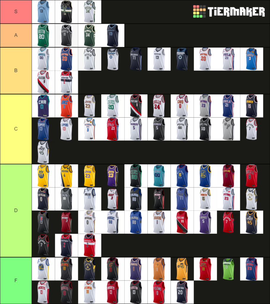
S Tier
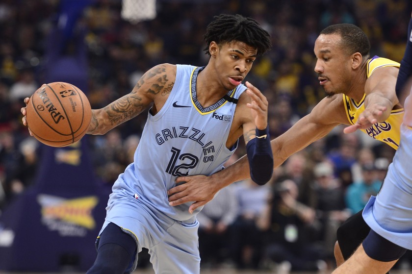
MEMPHIS GRIZZLIES
The best solid color in the NBA right now. The logos are perfectly understated, while the collar offers a subtle yet exciting contrast to this clean, modern design.
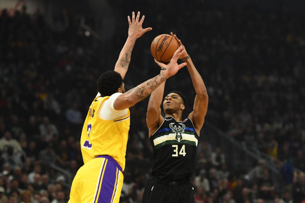
MILWAUKEE BUCKS
This is certainly not a conventional design, but there’s something special going on with the Bucks design team, and their 2020 “statement” jerseys are no exception. The black plays unexpectedly well with the Milwaukee cream and green, but even more surprising is the additional solid blue line. This is courageous design at its finest.
A Tier
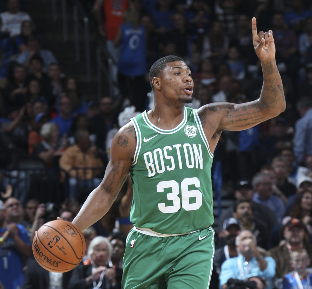
BOSTON CELTICS
A perfect example of the power of simplicity. The timeless look is brought to the modern age with an inviting shade of green, and just the right typeface.
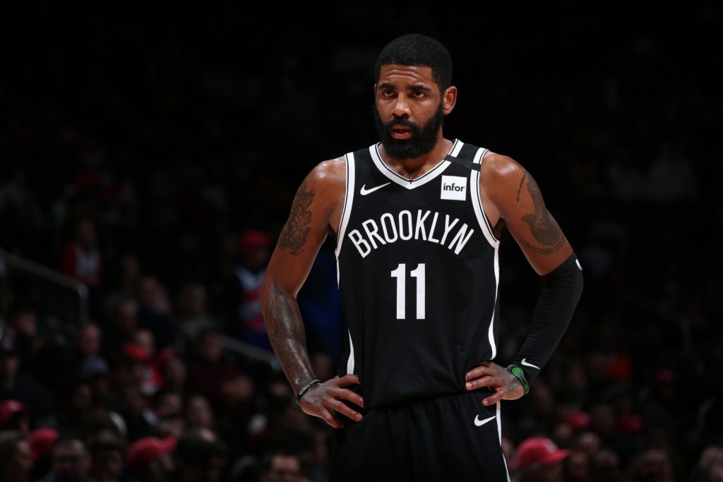
BROOKLYN NETS
This jersey is capable of striking fear into the hearts of any opposition. The only thing keeping it out of S Tier is a less-than-ideal typeface.
B Tier
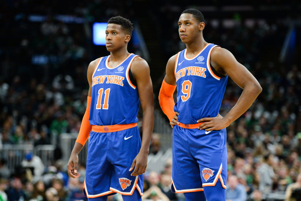
NEW YORK KNICKS
Orange is justifiably controversial, but it is utilized well with these bright, fun-loving jerseys which harken to past greatness. The particular shade of blue is not our favorite, but it is forgivable.
C Tier
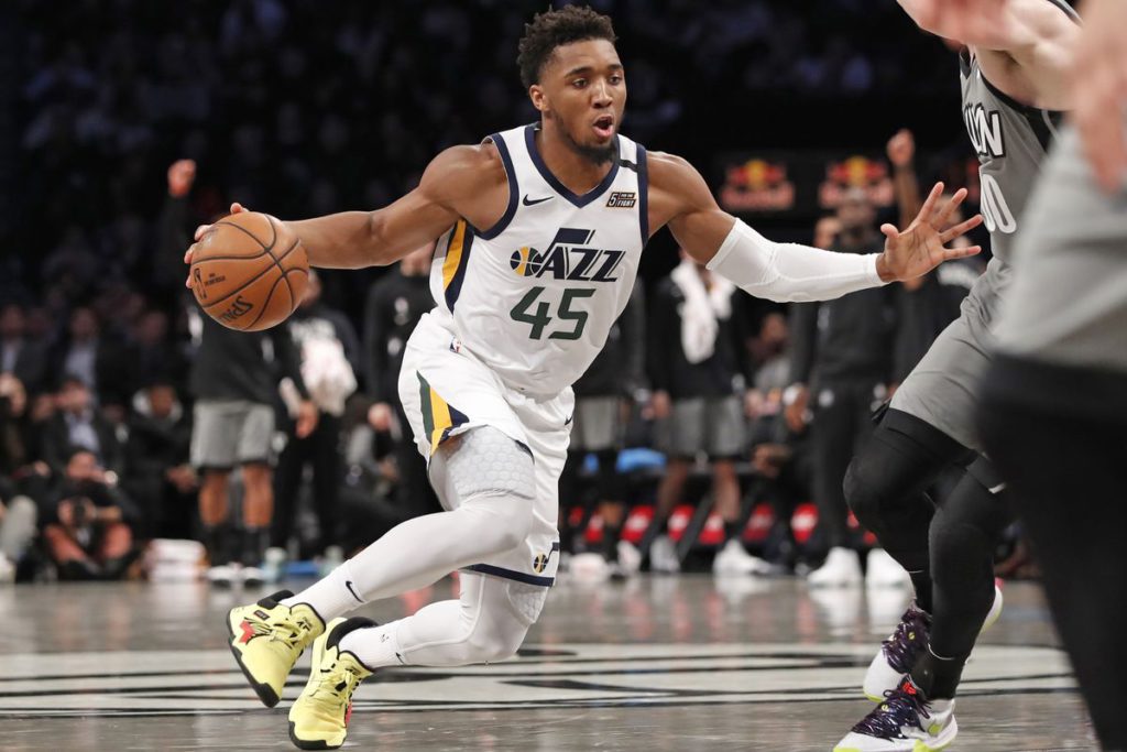
UTAH JAZZ
There’s nothing horribly offensive here, but there’s nothing to love either. The jersey number typeface feels incongruous with the Jazz text logo both in color and in shape, but the striped accents are executed well enough to keep this jersey out of the garbage bin.
D Tier
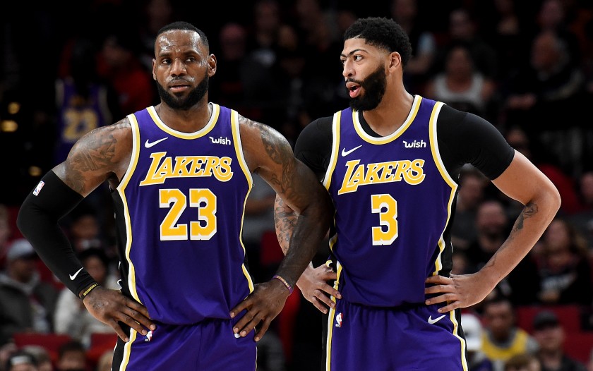
LOS ANGELES LAKERS
A timelessly shit color combination. These jerseys are only ever revered by association with the great players who were forced to don them in eras past. All you have to do is ask yourself, would you EVER wear purple and yellow?
F Tier
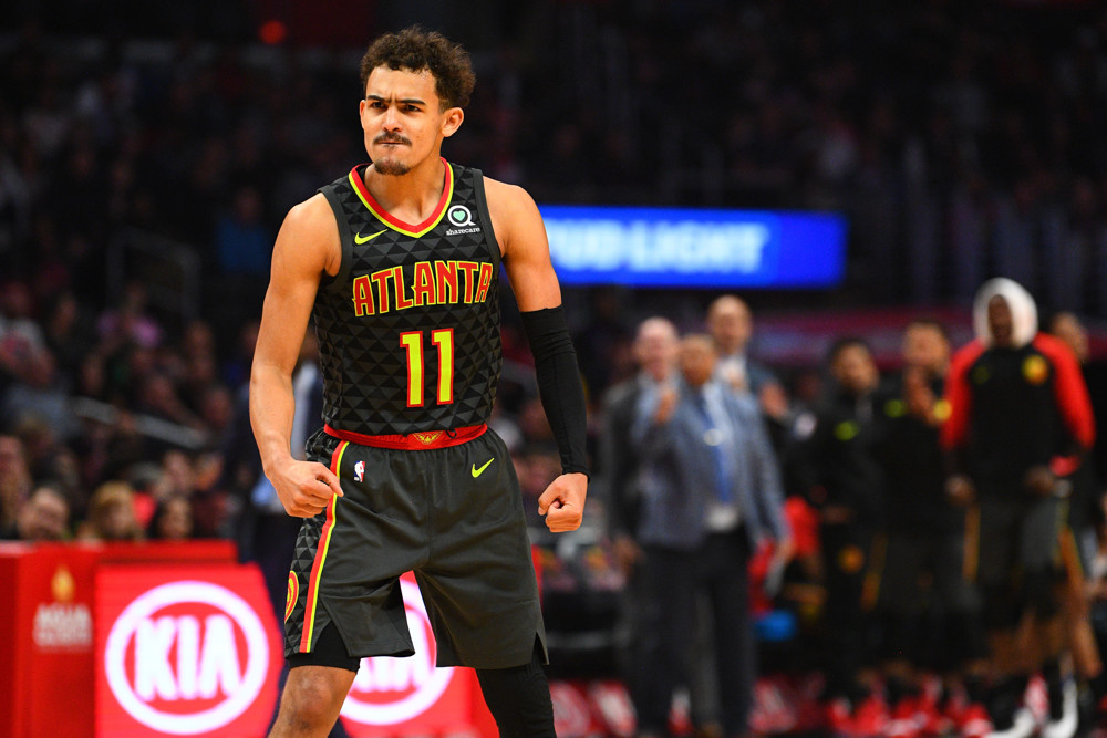
ATLANTA HAWKS
Whoever is working on the Hawks design team should have been fired long ago- and I say that because their jerseys have been awful for as long as I can remember. I did not expect them to get even worse though, as they have this season. It doesn’t take a genius to know that black, bright red, and neon green do not play well together, and that doesn’t even address the horrendously busy triangle pattern that covers the entire jersey. Absolute dogshit from top to bottom.
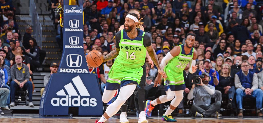
MINNESOTA TIMBERWOLVES
I mean holy fuck. The pigment that created this shade of green should be rounded up and incinerated before it’s released upon humanity again. You’re supposed to have guards crossing, not crossing guards.
